Dwell-Time Data Insights for COVID-19 Recovery in US Cities
Habidatum just launched their Mobility Monitor data portal. In an exclusive for CoMotion NEWS, Habidatum looks at how measuring dwell-time shifts can explain divergent policy responses and outcomes in response to COVID-19. Alongside the entire global economy, $16 trillion in US commercial real estate has been acutely impacted by the virus, and the Center for Disease Control (CDC) estimates that the virus could kill up to 240,000 Americans. Data driven solutions for reducing disease transmission and planning a post-virus recovery for cities will be key for saving lives and the economy in the US and abroad.
To enable policymakers and planners to plot a path to coronavirus recovery and beyond, Habidatum has published new datasets on urban mobility and infection rates before and after the implication of social distancing and shelter in place orders.
The accompanying map shows the relationship between mobility in US cities before and after the implementation of social distancing. The mobility data is then compared with infection rates for key metropolitan areas across the US. The wide range in effectiveness of social distancing in limiting virus transmission indicates that the reopening of the country “business by business” is not necessarily a realistic solution, but rather should be approached “block by block” with a focus on areas where social distancing is effective and virus transmission rates are abating.
The mobility map uses anonymized and aggregated mobile GPS location data to visualize changes in mobility relative to the national average (in percent) on recent days versus dates prior to the implementation of COVID-19 social distancing measures (February 22 – 29). The result of social distancing measures in changing mobility patterns is indicated as a positive (red, good) or negative (blue, bad) percentage change measure, updated daily, for Core Based Statistical Areas (CBSAs).
CBSAs were selected as the spatial unit for their population threshold, and ability to highlight differences between central cities and suburbia.
Social Distancing Adherence and COVID-19
Mobility Monitor follows three groups of activity patterns based on the duration of time before there is device movement between 500*500 meter geographic grids (dwell-time):
-
- On the Move (Under 15 minutes dwell-time)
- Out and About (16 minutes – 3 hours dwell-time)
- Work / Leisure (3 – 8 hours dwell-time)
The focus of the following analysis is on the relationship between relative changes to the On the Move dwell group and the relative change to COVID-19 per capita numbers.
The On the Move dwell group, measuring people moving from one location to another (e.g. pedestrian traffic), is likely the most risky mobility behavior in terms of spreading the virus. The bigger the decrease to the On the Move dwell pattern, the less at risk the community, and better demonstration of adherence to guidelines.
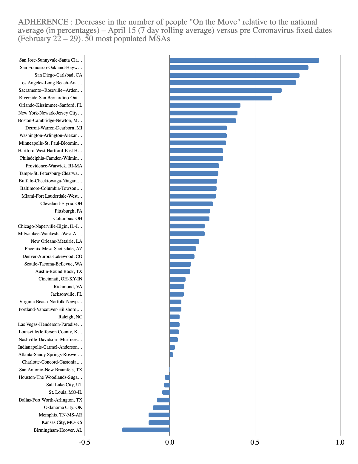
ADHERENCE: On the Move (Adherence) geographical distribution over the US territory is organized around macro regions. South-Western and South Eastern urban areas, especially California and Florida respectively, lead the country in terms of high Adherence rate. Next comes the North East (New York, Boston) and the Rust belt (along Great Lakes shores – Milwaukee, Chicago, Detroit, Cleveland, Buffalo) with Adherence rate somewhere in the middle. The worst Adherence rate is observed in the Old South, Deep South and New South (Texas and Louisiana).
Map: On the Move dwell category, April 15th, 2020, South and South East
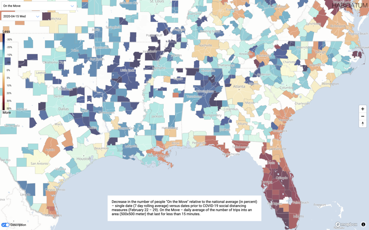
High Adherence rate could be both the result of significant social distancing efforts – most likely the case of California cities, as well as a major population shift, caused by dramatic drops in tourist crowds, like in Florida.
On the opposite side of the spectrum, low Adherence may relate to suspicion towards strict quarantine measures, low income pressure, high unemployment, or values misaligning with Stay-at-Home orders.
INFECTION: A key indicator – the delta between local CBSA cases per capita and the national average for CBSAs per capita cases shows how far above/below the national average a community’s infection rate.
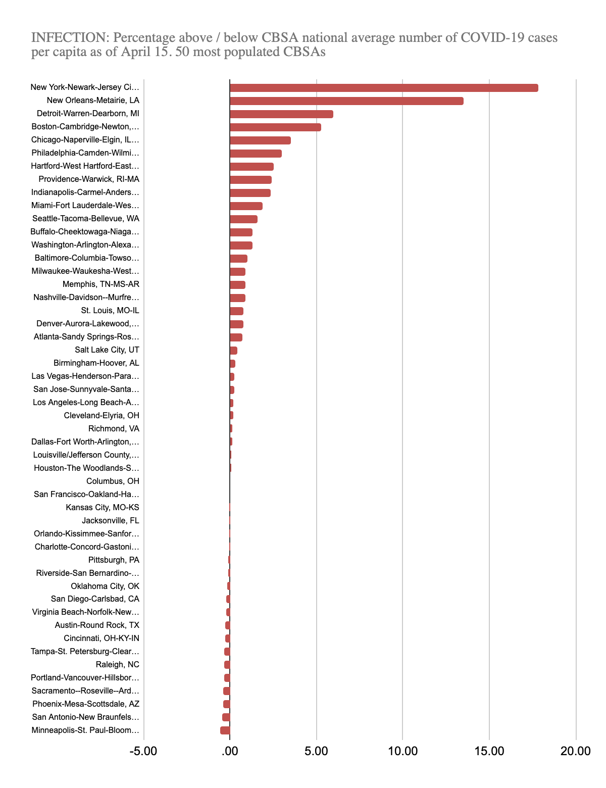
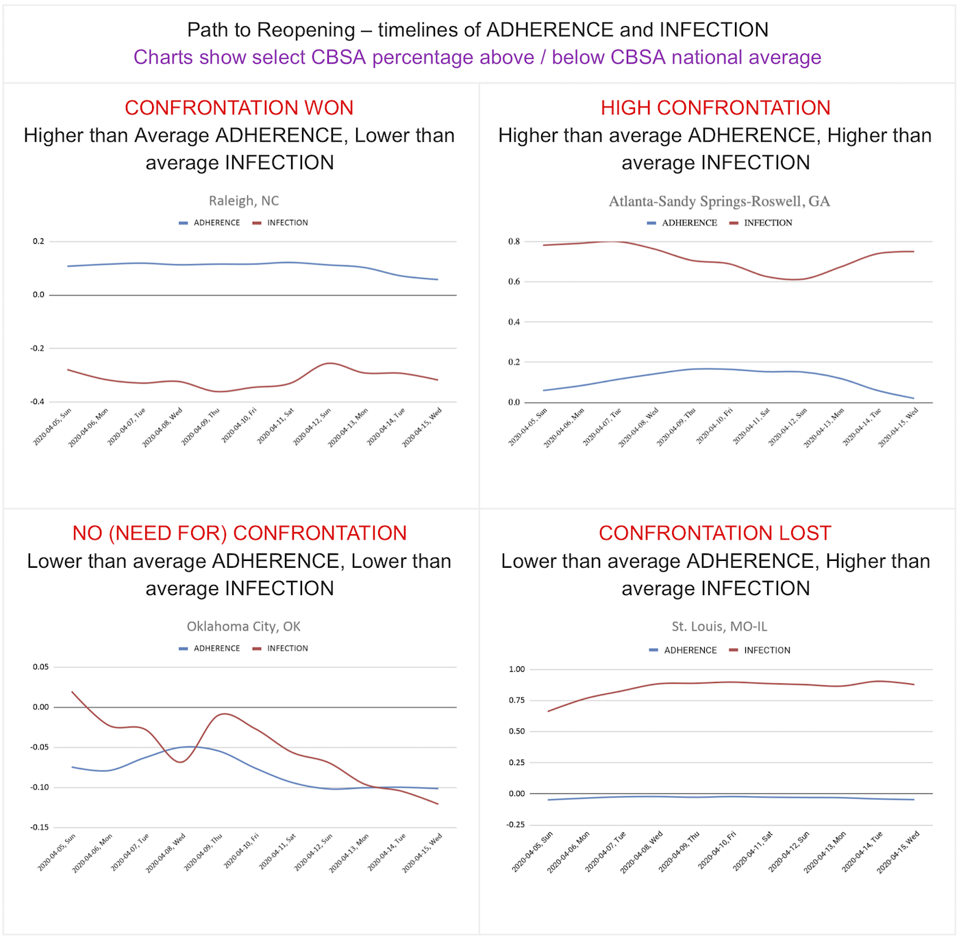
Strict ADHERENCE may coexist both with lower than average INFECTION (as is the case for Raleigh, NC CBSA), and with higher than average INFECTION (as is the case with Atlanta-Sandy Springs-Roswell, GA CBSA, and New York-Newark-Jersey City, NY-NJ-PA below).
There is a possibility of low ADHERENCE coexisting with low INFECTION (as is the case for Oklahoma City, OK CBSA), and, on the contrary, low compliance coexisting with high INFECTION (as is the case for St. Louis, MO-IL CBSA).
The four charts (above) represent a transitional cycle (counter clockwise) from no to lost confrontation through high and won to no need for confrontation. This cycle is expected to be a temporal pattern for each and every city in the country, possibly discoordinated in time and space.
Extreme Confrontation in New York
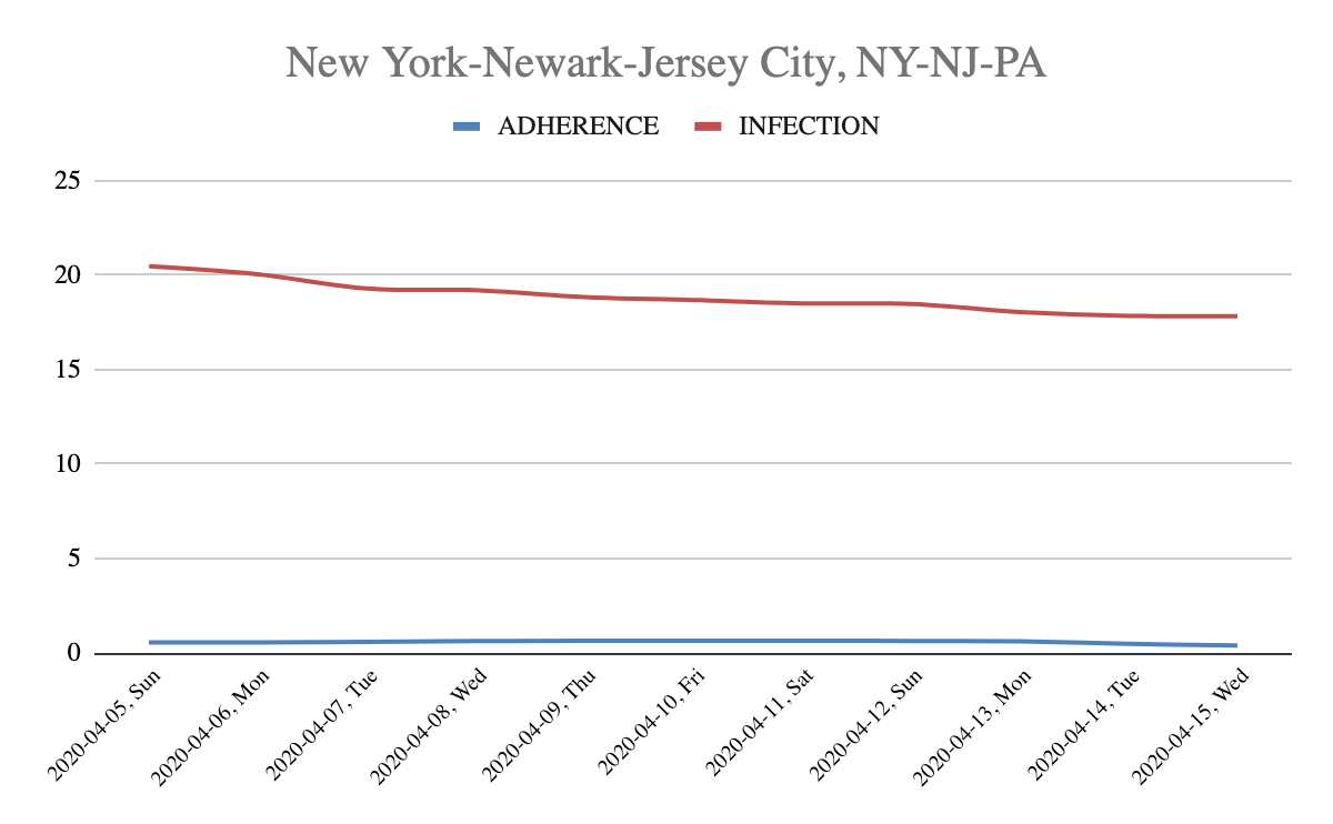
Note: Is New York effort high enough?
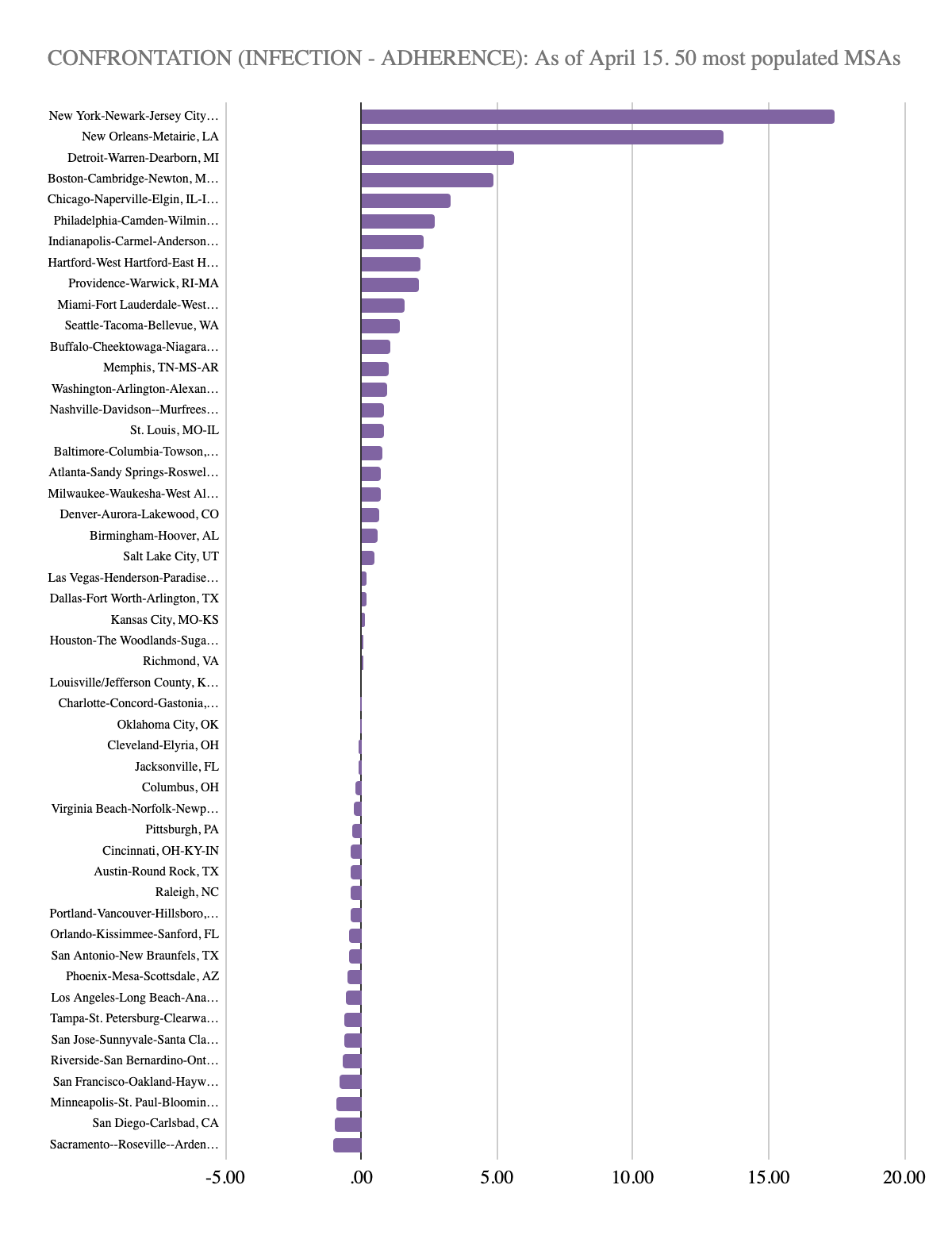
CONFRONTATION: The scope for the effort required for keeping the cases per capita down can be measured by finding the distance between ADHERENCE and INFECTION. Visually this is the distance between the red and blue lines on the charts. For six of California’s biggest cities this indicator is negative, meaning that the increase of ADHERENCE over the national average is higher than the increase over national average for INFECTION — a good start for moving behind the apex.
Reopening the Economy: Next Steps
Dwell-time measurements are important for behind the curve strategies. Lifting the quarantine and opening the economy may be a lengthy geographical campaign. The blueprint for reopening is spatiotemporal, a geographical puzzle being adjusted over time.
People expect the reopening of the country “business by business”, but in reality it will likely be “block by block”. Geography matters here, but not only, the timeline and the sequence of geographical patterns of quarantine lifting initiatives will likely be another key parameter. One thing we can say for sure, it is not going to be “one size for all”, neither with respect to geography, nor with respect to time.
Map: On the Move dwell group, April 15th, 2020, New York City
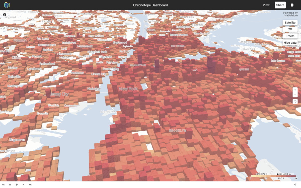
Although this analysis is presented at the CBSA level – mobility data is present at hyperlocal geographic levels – here is a snapshot of concentrations of people on the move in New York City on April 15, 2020, by 500*500 meter units.
Calculating a REOPENING index brings us to a number of observations regarding the preparedness of communities for opening the economy in relation to the size of the population and its location in dense central cities or less populated suburban areas.
If the INFECTION is negative (below national CBSA average) then the REOPENING phase is closer. If the INFECTION is positive, then only high EFFORT could move the REOPENING phase in the right direction, otherwise things may worsen.
The next step for this research, as the US aims to reopen the economy, will be estimated days until quarantine is lifted for each of the CBSAs, using the REOPENING ratio and benchmarks in urban areas that have already been way behind the peak.
COVID-19 confirmed cases data from https://usafacts.org/visualizations/coronavirus-covid-19-spread-map/
CBSA population data from https://www.census.gov/data/tables/time-series/demo/popest/2010s-total-metro-and-micro-statistical-areas.html
By: William McCusker, Nikita Pestrov, and Alexei Novikov
 William McCusker, Director of Partnerships for Habidatum International and Co-Founder of Mobility Monitor. He leads the development of data focused digital solutions for urban planning, real estate, and civic tech projects. Recent work includes developing an inclusive growth mapping tool with Mastercard – Inclusive Growth Score, transit and nightlife studies with South Florida Commuter Services, and urban expansion and violent crime tracking with NYU –The Atlas of Urban Expansion, American Violence. William helps companies to activate and responsibly distribute their data, while providing clients with innovative data-driven solutions.

Nikita Pestrov, Data Science Lead at Habidatum, is focused on developing tools that empower urban planners to make data-driven decisions. Nikita has a software development and mathematical background. He joined Habidatum after studying at MIPT, Skoltech and MIT Media Lab. At Habidatum Nikita leads space-time analysis projects using his machine learning and data visualization skills.

Alexei Novikov, Chief Executive Officer and President at Habidatum International, Inc. Prior to Habidatum he served as a Managing director at Thomson Reuters and Standard & Poor’s. Phd in Urban Economics and Regional science.


